877-401-1897
Buy Q
Features
Use Cases
OBJECTIVES
Automatic Updating
New Product Development
Tracking Analysis
PowerPoint Reporting
Customer Feedback
Data Visualization
Segmentation
OBJECTIVES
Brand Analytics
Pricing Research
Survey Analysis
Data Stories
Advertising Research
Data Cleaning
TECHNIQUES
Driver Analysis
Statistical testing
Factor Analysis
Regression
Correspondence Analysis
Cluster & Latent Class
TECHNIQUES
Text Analysis
MaxDiff
Conjoint
Crosstabs
TURF
Weighting
Pricing
Customers
Reviews
Customer Stories
Resources
LEARN
Blog
eBooks
Webinars
Market Research Guide
The Data Story Academy
The Data Story Guide
SUPPORT
Q Help Guide
Support
Hire a Researcher
FEATURED READ
How to Fit a Structural Equation Model in Q
Get the blog
ss
Free Trial
Book demo
877-401-1897
Contact
Buy Q
Free Trial
Book demo
877-401-1897
Blog
Categories
All
Advanced Analysis Techniques
Choice Modeling/Conjoint Analysis
Dimension Reduction
Correspondence Analysis
Principal Component Analysis
MaxDiff
Regression
Driver Analysis
Segmentation
Cluster Analysis
Latent Class Analysis
Text Analysis
Market Research Topics
Using Q
Beginner's Guide
Filtering
How To
Reporting/Exporting
Troubleshooting Common Issues
Using R/JavaScript
JavaScript
R
Visualizations
SUBSCRIBE
Keep updated with the latest in data science.
Search our blog
Advanced Analysis Techniques
Choice Modeling/Conjoint Analysis
Dimension Reduction
Correspondence Analysis
Principal Component Analysis
MaxDiff
Regression
Driver Analysis
Segmentation
Cluster Analysis
Latent Class Analysis
Text Analysis
Market Research Topics
Using Q
Beginner's Guide
Filtering
How To
Reporting/Exporting
Troubleshooting Common Issues
Using R/JavaScript
JavaScript
R
Visualizations
Correspondence Analysis.
Correspondence Analysis
|
Dimension Reduction
|
Market Research Topics
|
Visualizations
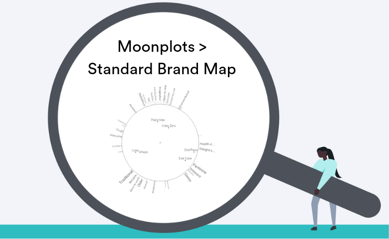
Moonplots: A Better Visualization for Brand Maps
by Tim Bock
Advanced Analysis Techniques
|
Correspondence Analysis
|
Dimension Reduction
|
How To
|
Latent Class Analysis
|
MaxDiff
|
Segmentation
|
Using Q
How to Do Advanced Analysis in Q (No Need to Rely on Others)
by Chris Facer
Advanced Analysis Techniques
|
Correspondence Analysis
|
Dimension Reduction
Focusing the Results of Correspondence Analysis in Q
by Jake Hoare
Advanced Analysis Techniques
|
Correspondence Analysis
|
Dimension Reduction
|
How To
|
Using Q
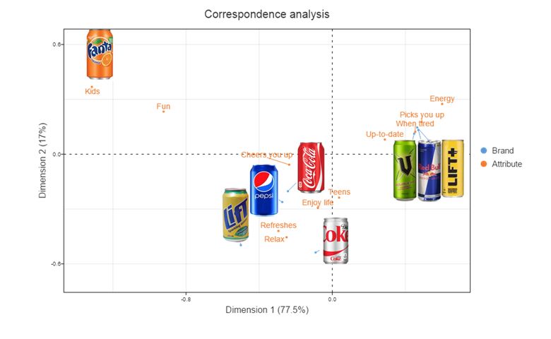
How to do Traditional Correspondence Analysis in Q
by Chris Facer
Advanced Analysis Techniques
|
Correspondence Analysis
|
Dimension Reduction
|
How To
|
Using Q
|
Visualizations
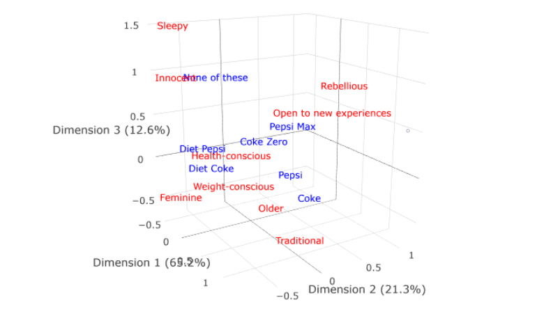
3D Correspondence Analysis Plots in Q
by Tim Bock
Advanced Analysis Techniques
|
Correspondence Analysis
|
Dimension Reduction
|
R
|
Using R/JavaScript
|
Visualizations
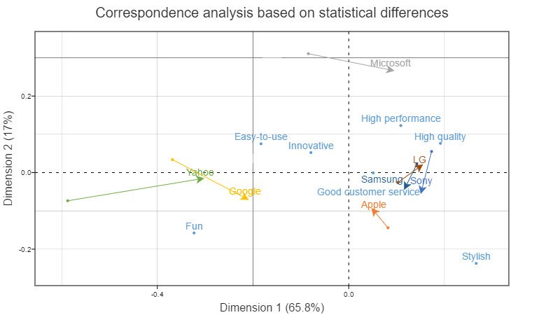
Customization of Bubble Charts for Correspondence Analysis in Q
by Tim Bock
Advanced Analysis Techniques
|
Correspondence Analysis
|
Dimension Reduction
Using Correspondence Analysis to Compare Sub-Groups and Understand Trends
by Tim Bock
Advanced Analysis Techniques
|
Correspondence Analysis
|
Dimension Reduction
|
Visualizations
Easily Add Logos to a Correspondence Analysis Map in Q
by Tim Bock
Contact
X
First name
*
Last name
*
Company
*
Email address
*
Message
*
Cookies help us provide, protect and improve our products and services. By using our website, you agree to our use of cookies (
privacy policy
).
Register now