How to Make a Snake Plot in Q and Export it to PowerPoint

Snake plot is the term used to describe a line chart on its side. So rather than the lines running left-right (x-axis) they run up-down (y-axis).
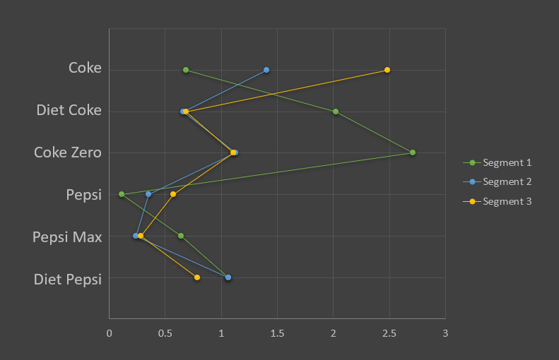
The image below is an example of a snake chart, created in PowerPoint.
Although it seems like it should be a simple chart to create, it is actually reasonably tricky in PowerPoint, and many researchers struggle with it. A snake chart is not really a line chart – it’s a scatterplot with lines connecting the points in each series (which happen to run vertically). It’s fiddly and confusing to set up in PowerPoint, which is why (understandably) many researchers get lost and frustrated making them. To avoid this fuss, Q has a built-in chart type that can create this visualization instantly. And, even better, it can automatically publish and update it into PowerPoint for you.
The aim of this post is to show you how you can set up a snake plot in PowerPoint. We’ll explore this in three ways:
- Making a snake plot in Q using its built-in chart type
- Manually setting up a snake chart in PowerPoint (as an Excel Chart)
- Creating an R Output to automate the updating of an Excel Chart within PowerPoint
It should be apparent by the end of this post that option 1 (Q’s chart) is far easier and less error prone compared to setting this up in PowerPoint. Whatever the case, this post is designed to help you untangle the snake!
Using Q’s built-in chart type
In Q, creating a snake plot is as simple as turning a table into a chart with the push of a button. Simply create a crosstab, and then go to Show Data As: Tables > Snake Plot in the ribbon.
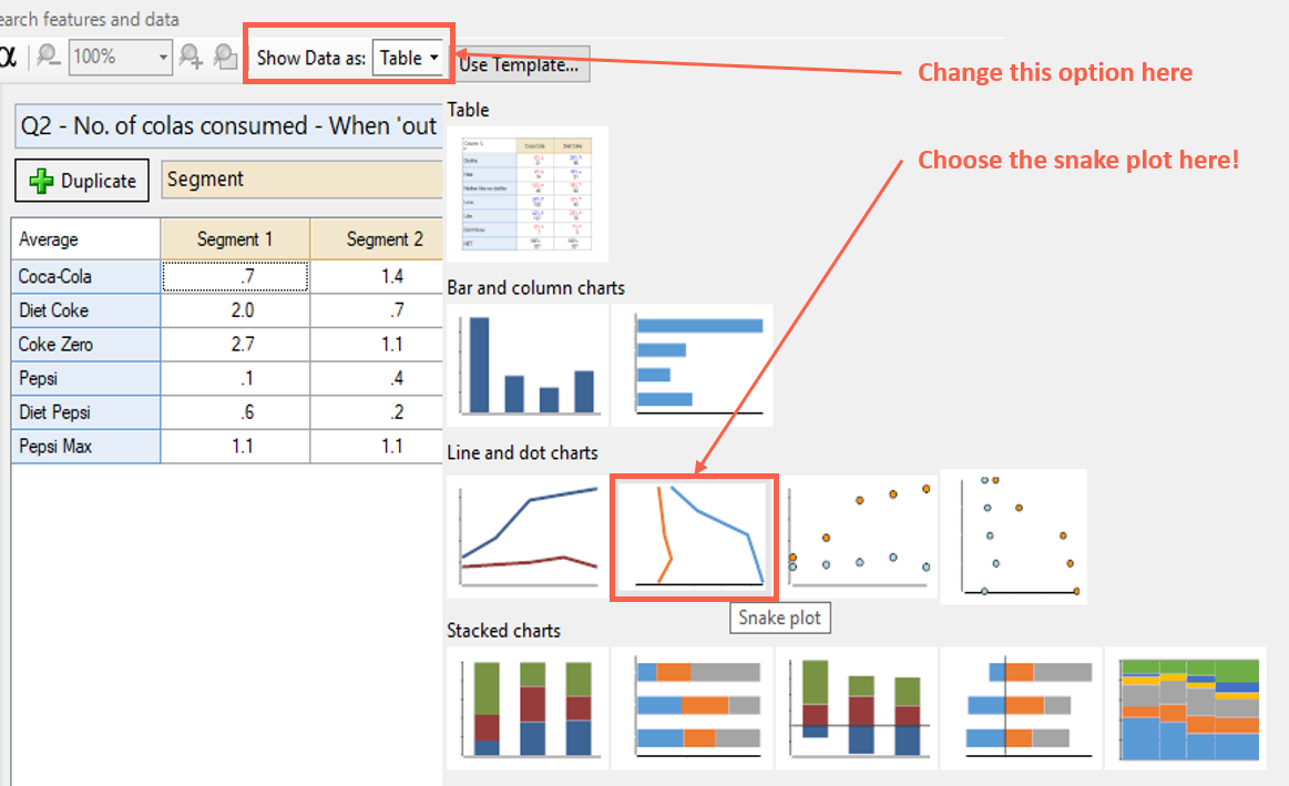
Q will then turn your table into a snake plot! The brown question (columns of the table) become the series (each line, or “snake”). The rows of the original table become the categories and the y-axis is labelled as such.
If you want to customize it, you can do this on the right-hand side with the Object Inspector. When you’re ready to export to PowerPoint, simply use the button in the ribbon. It will also update automatically into PowerPoint in the normal way (if you re-export at any time).
Setting up a snake plot within PowerPoint as an Excel chart
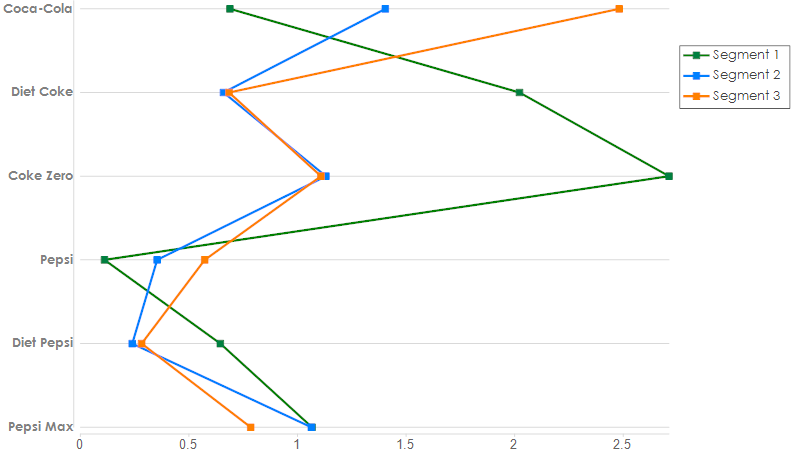
Setting up a snake plot within PowerPoint without Q’s assistance is possible, but hard! They are technically Excel Charts within PowerPoint. Consider the data below, consisting of the spreadsheet within PowerPoint used to create both images of the snake plots above.
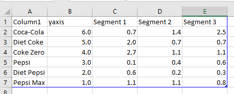
Notice that there is a column B which is numbered 6 to 1 in decreasing order. This is essential to the chart because it needs to reference these as points for the y-axis. So if you don’t have this in your source table, you’ll need to include it.
To turn this into a chart within PowerPoint, you need to have the chart type within PowerPoint set as an “X Y Scatterplot with Straight Lines and Markers”. Then the tricky bit is telling PowerPoint how to reference this information (using Chart Options > Design > Select Data in PowerPoint). I find it’s often easier to start from scratch with this (i.e. remove all the legend entries and start afresh with the window below).

Then, you need to Add in each series to the box on the left. With each, you set up the references cell/arrays, as per the below:
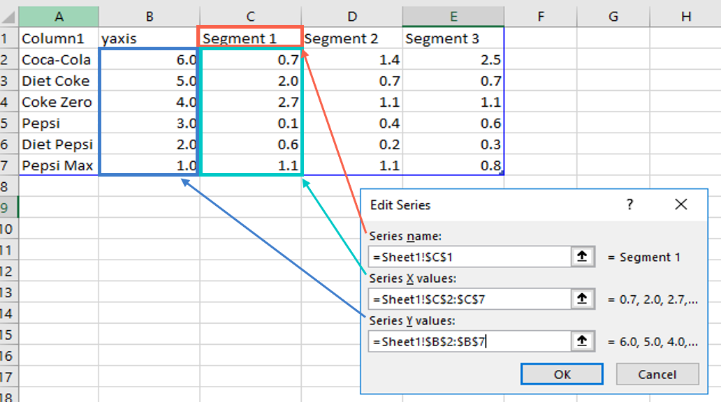
You’ll need to repeat this for each series. In the above example I had three. If you have lots of series, then it may take a bit of time!
Then you design the chart within PowerPoint as appropriate (using the chart tools). The major drawback of doing this in PowerPoint, is that you can’t specify the y-axis labels (i.e. column A in that data table above). Researchers get around this by inserting a table into PowerPoint to sit adjacent/underneath the snake plot which contains the labels – it’s a bit clunky!
How you can use an R Output to help automate the updating
In the example above, we created the snake plot in PowerPoint and needed Column B (which is an array of integers in descending order). This is something you would need to insert manually into the PowerPoint data source.
If you’re using Q, you can write an R Output that does this for you. This can give you the ability to update the Excel Chart automatically into PowerPoint from Q.
Suppose you set up a table as per the example above – the average number of colas consumed (rows) by segment (columns). Let’s say it had a reference name of sourcetab. If you wanted to make a table that’s in the right format for PowerPoint, you could augment the table by using an R Output (Create > R Output). The code for the R Output would be as follows:
data = sourcetab
yaxis = nrow(sourcetab):1
export_table = cbind(yaxis,sourcetab)
export_table[,1:4]
This creates a table (as an R Output) as per the following:
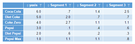
The second line of the code creates an array that is equal to the number of rows in the source table working backwards to 1 an integer at a time. If you’d written 6:1, it would be an array of 6,5,4,3,2,1. Likewise, 1:6 would be an array of 1,2,3,4,5,6.
Once you export this to PowerPoint, as an XY Scatterplot, you still need to go through the manual setup process as per the previous section of this article. The benefit of doing it this way, is that if you data changes (in Q), you can automatically update the table, and therewith the plot, in PowerPoint.
The fourth line in the code is optional, but I recommend it. Why? Because when you set it up manually in PowerPoint, you only do that for a certain number of series (3 in this case). If the number of columns were to change for whatever reason (e.g. to include a 4th Segment), then this will cause PowerPoint/Q to throw an error (it doesn’t know what to do with the additional series Q is feeding it). To safeguard against that, the fourth line of code there specifies that we only want the first 4 columns (including y-axis) in any output.
Try it yourself
You can download the data and R code used in the worked example in this post here.