
The most standard way for graphically representing categorical data is with a column chart. The advantage of using column charts is that you can easily see the differences between categories. While these charts can handle multiple series of data quite well, the ease of making comparisons decreases as more data points are added. This article will outline the steps for generating a column chart visualization in Q using either the Chart or Visualization menu.
The Chart menu
You can generate standard charts like the column chart in Q based on tables or crosstabs that you have already built through a 2 step process:
- With the table of interest selected, go to the select, from the menu, Create > Charts > Chart.
- Select the image of the chart type you desire. The column chart is the first option within the Bar and column charts section.
After Q has generated the chart, you can choose which questions to place in the rows or columns using blue and brown drop-downs just like creating standard Q crosstabs. The question placed in the blue drop-down menu will create the groupings along the x-axis while the question placed in the brown drop-down menu will be charted as clusters of bars for each of the x-axis groupings. You can also alter features of the chart with options listed in the Chart section of the Object Inspector (the panel on the right-hand side of the screen). Options include background color, size of gap between bars/columns, fonts, and more.
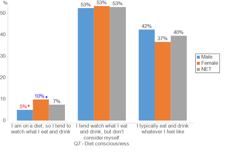
For this example, I will be comparing the gender split among responses for a question about diet consciousness:
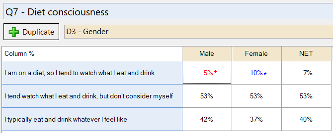
Like most options in the Chart menu, any significance arrows will be carried over from the table. This column chart illustrates the significant difference between men and women that responded with “I am on a diet, so I tend to watch what I eat and drink“.
The Visualization menu
As an alternative, you can also create charts as visualizations. These options are powered by R code and give you greater flexibility for customization.
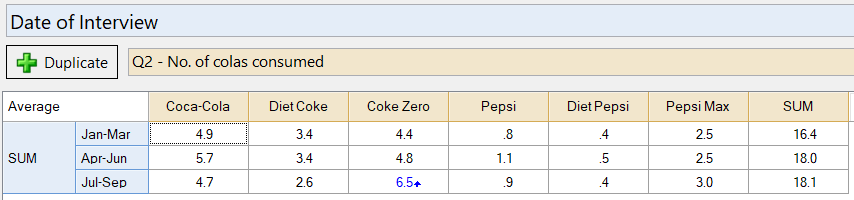
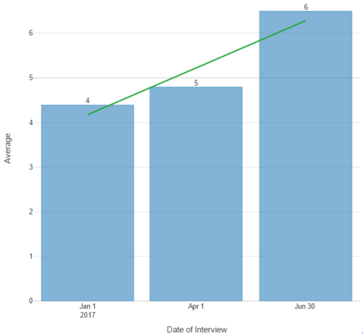
I will create a column chart which tracks the number of colas consumed on average by quarter. For my data input, I’ve constructed a crosstab of “Number of colas consumed” by quarter, placing the colas consumed question in the blue drop down and the date question in the brown drop-down. In the Statistics – Cells of the table I am showing the Average (an average of each respondent’s total number of colas consumed).
To create a column chart using this table as an input:
- Select Create > Charts > Visualization > Column Chart.
- Click Inputs > DATA SOURCE > Output in the Object Inspector on the right, and select your table from the list.
- Click Automatic. This ensures the chart will re-draw itself whenever the input data changes or you change any chart settings.
- Change formatting options in the Chart section of the options on the right.
The visualization of the chart appears as such:
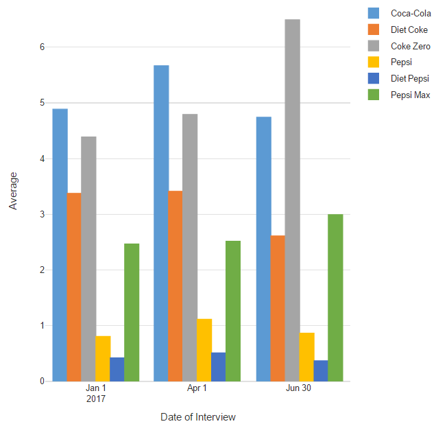
It is easy to see the colas most and least consumed each quarter, but it is difficult to make note of changes in brand consumption due to the volume of information presented. In addition, the visualization does not have data labels, so any differences that we observe will only be approximations. To remedy these points, I can adjust the data to only show the overall consumption for one brand (Coke Zero) and add data labels and trendlines from the Chart section of the Object Inspector.
Now that you’ve conquered constructing column charts, discover what other visualizations you can create in Q!