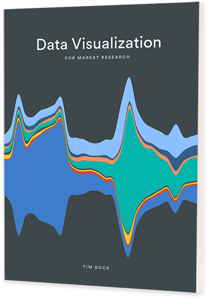
A new book to help you craft visualizations that allow your audience to grasp the story in your data.

Beautiful. Memorable. Professional. Are these words used to describe your data visualizations? They can be! This book is designed to help you craft visualizations that instantly allow your audience to grasp – and remember – the story of your data.
It covers everything from the fundamentals of good graphic design for data viz to how to tap into the secrets of information processing. Twenty-four techniques for improving visualizations are illustrated with almost one hundred examples of the good, the bad, and the downright ugly.
This book shows you how to create visualizations that improve storytelling. It focuses on visualizations that work with standard market research data. You will discover new ways to visualize market research data and learn how to easily design compelling charts and graphs.
Good data visualization makes it easy for audiences to effortlessly uncover the story in your data – to find the patterns that matter the most. Making data based decision making a fast reality.

Data Visualization for Survey Data
- Present and make the most of research findings, using foundational (and some maverick) idea
- Provide insights into how the target audience/reader/viewer processes and takes in information
- Focus on market research examples using survey data.
- Twenty-four techniques for improving visualizations are illustrated with almost one hundred examples of the good, the bad, and the downright ugly.


