
The Complete Guide to Market Research
Reporting
Reporting
- Conduct all the analyses listed in the Analysis Plan and any additional analyses.
- Use Data Reduction to distill the essence of each of the analyses.
- Creating charts.
- Structuring and Sharing Findings
Charts
Our brains are much more efficient at processing images than at processing numbers. By presenting tables as charts we can make it much easier for people to interpret findings. Plotting Summary Tables using pie charts and column charts is straightforward. Unfortunately, with more complex tables, it is not the case that any chart is better than a table. Our brains are only good at interpreting images when the images are structured in particular ways.
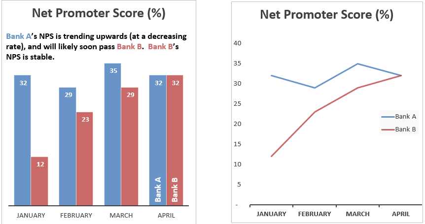
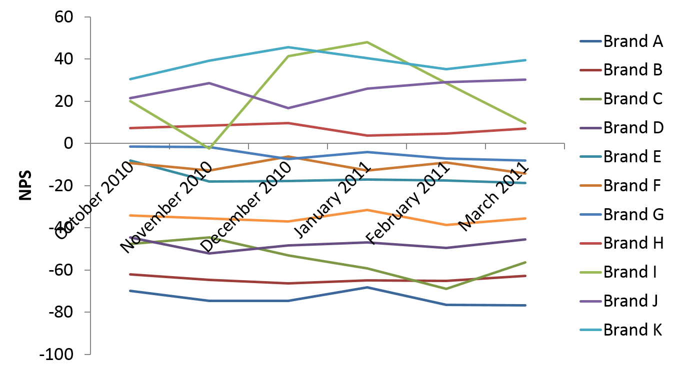
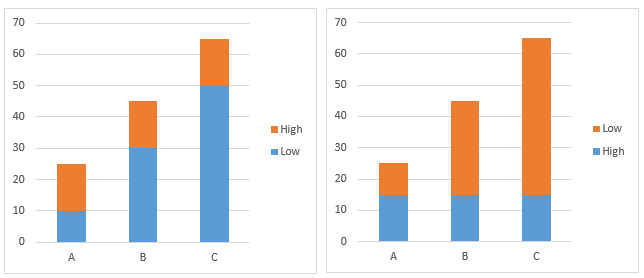
Use columns for comparisons and lines for trends
The two charts below show the same data. When we look at the plot on the left our brain automatically tries to compare the height of the columns. If we look hard enough and read the comment we can see a trend. However, when we look at the plot on the right the trend is so clear it does not need to be described. The general conclusion is to use columns when wanting to emphasize and compare individual results and lines when wanting to emphasize and compare trends.


Minimize difficult comparisons by using grid layouts
The table below is large and complicated. It is not straightforward to examine it for conclusions.
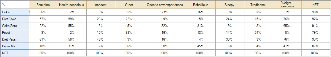
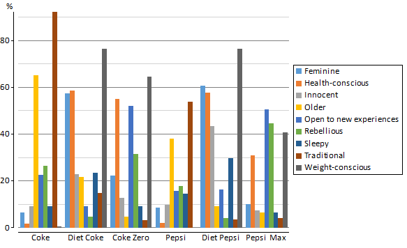
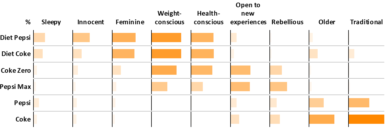
A ‘standard’ way to plot such data is as a column chart, as shown below. While prettier than the table, it is actually less useful. Consider trying to work out which brand is most strongly associated with being Sleepy. On the table we can quickly read down the appropriate column. In the chart below it is much harder to work out.
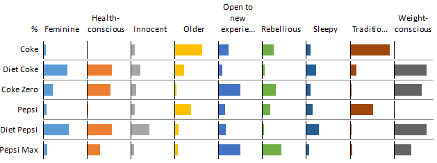
The solution to this charting problem, and to many charting problems, is to create a structure that is more grid-like, as shown below. The reason that this chart is better is that it replaces numbers with bars, without sacrificing the ability to read by rows or columns. Thus, we can quickly scan this chart to identify that, for example, Diet Pepsi scores the highest on Sleepy.
This same basic principle is useful for time series data as well. Consider the default line chart created by Excel, shown below. It is very different to disentangle the meaning in this data.
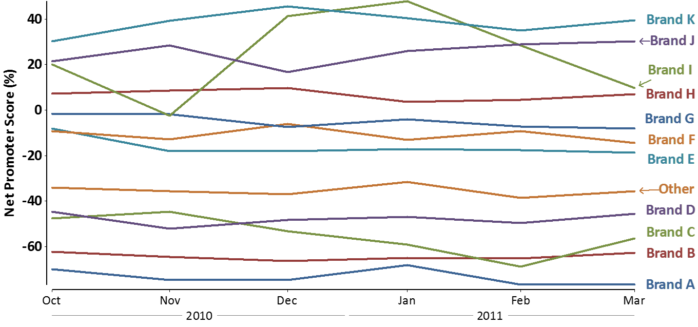
We can get a small improvement by replacing the legend with individual labels on each line (this makes the comparisons easier because the reader does not have to continually work out which line to use).
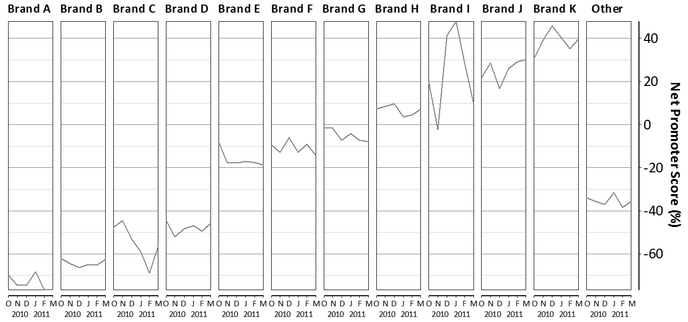
However, the chart below, which again adopts a grid like layout, and also orders the results, is substantially easier to interpret.
 .
.
Use color and redundancy to emphasize
In a traditional chart is used to indicate different series. For example, in this chart blue is used for feminine and health orange for health-consciousness. This use of color is unhelpful. Our brains infer the colors as indicating that the columns are ‘different’ in some way, which makes it harder for us to accurately compare the columns and thus color in this context completely undermines the purpose of the chart.
A better use of color is in the chart below. Color is still being used but it is being used in a different way. The intensity of the color is proportional to the length of the bars. This redundant use of information helps our brains interpret the chart (see Ordering for a further improvement of this chart).

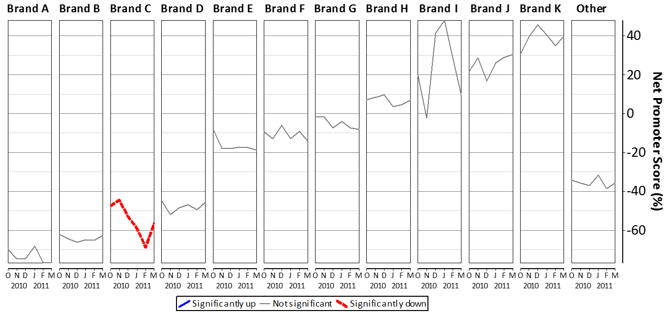
The next chart improves on the earlier time series chart. Note that color is used here to emphasize interesting results. In this case, it is used as a way of communicating the results of statistical testing.
Software
Most statistical packages can do the types of plots shown on this page (e.g., SPSS, R, SAS). They can also be created with a bit of work in Excel (e.g., by creating multiple charts and lining them up, or, by buying add-ins). The simpler plots on this page were created in Excel. The ‘grid’-style plots were created in Q, which is the only specialist survey-analysis program that implements these styles of plots.
Data Reduction
Deleting
The crosstab below shows how preferences for different brands of cola differ by age, gender and income. It is quite typical of the type used by commercial consultants when analyzing surveys. It is a very large crosstab. Indeed, it is so large that it is impractical for anybody to read everything on this crosstab and thus key findings hidden in the crosstab may easily be missed.
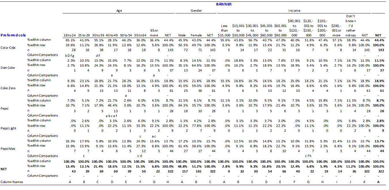
We can greatly improve this crosstab by deleting things. The reason that this works is that the more things on the page the more our brain gets distracted and thus the more we delete, the clearer the story in the data will become. The key things that we can delete from this table are:
- All the statistics except for the column percentages. That is, we should delete counts (labelled N), row percentages (% within row). Of course, in some situations these additional statistics may prove to be useful, but more often-than-not they are not useful and thus the default should be to remove them.
- The decimal places. Due to sampling error it is very rare that differences in decimal places are relevant and thus they should not be shown.
- All of the income and gender data. The column comparisons show no significant differences for gender and thus the differences between male and female preferences for different brands of cola are likely due to sampling error and are thus not interesting. The case for deleting income is a little more complex. The only significant difference relates to the preference for Pepsi Max being relatively high among the people with incomes of $120,001 to $150,000/. This pattern seems counter intuitive: why should this small brand appeal to such a narrow income-based demographic. Consequently, it likely reflects one of those flukes that comes up from time-to-time in surveys and thus, in the absence of any corroborating evidence, should be ignored.
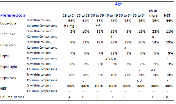
The much simpler crosstab that results is shown below.
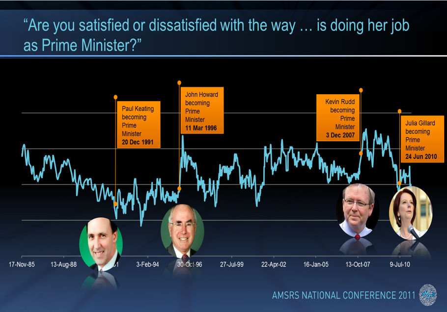
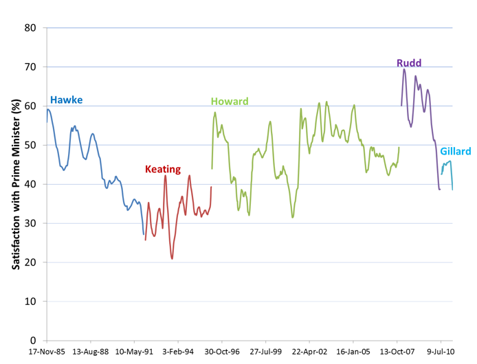
The same basic idea can be applied to charts as well. The example below is from a PowerPoint presentation showing the popularity over time of some of Australia’s Prime Ministers. The plot beneath makes the pattern in the data much more clear by:
- Deleting the background colors.
- Smoothing the lines (i.e., deleting the small random deviations).
- Deleting the chart junk (i.e., the callouts with the Prime Minters’ names.
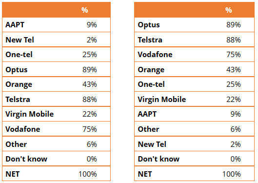
Ordering
The two tables below show the same data. The one on the left is ordered alphabetically. The one on the right has been sorted by values. For most purposes, the table on the right is more useful as it allows people to quickly work out the relative performance of the options (which is usually the main interest when interpreting any table).
The idea of ordering information is more general than that of sorting. Consider the following two charts. The one on the left is substantially better in terms of communicating the pattern.[2]
When dealing with large tables the most useful way of ordering the tables is to use diagonalization. The basic idea of diagonalization is that the rows and columns of tables are re-ordered such that a near-diagonal pattern appears in the table. This allows our brains to recognize a pattern, which in turn makes it much easier to process the data. Note how in the second of the plots below it is really easy to see which brands are similar to which other brands and why.
References
- Jump up↑ Collins, M. (1992). “The data reduction approach to survey analysis.” Journal of the Market Research Society 34(2): 149-162. Ehrenberg, A. S. C. (1975). Data reduction: analyzing and interpreting statistical data. New York, John Wiley.
- Jump up↑ Ehrenberg, A. S. C. (1975). Data reduction: analyzing and interpreting statistical data. New York, John Wiley.